
Solving a core business problem through design and investigative research
Role: Design lead + Original concept | Company: Uber
The problem
Completion rates for Uber Health rides were significantly trailing their rider app counterparts.
Key takeaways
Overall completion rates were 2.7% lower than the core Uber app.
Rides canceled by the driver were 5.4x higher than the core Uber app.


Connecting the dots
What we learned
NPS surveys and feedback from churned health orgs indicated a desire to track rides while on the go.
Various uRate feedback from coordinators cited the need for mobile booking.
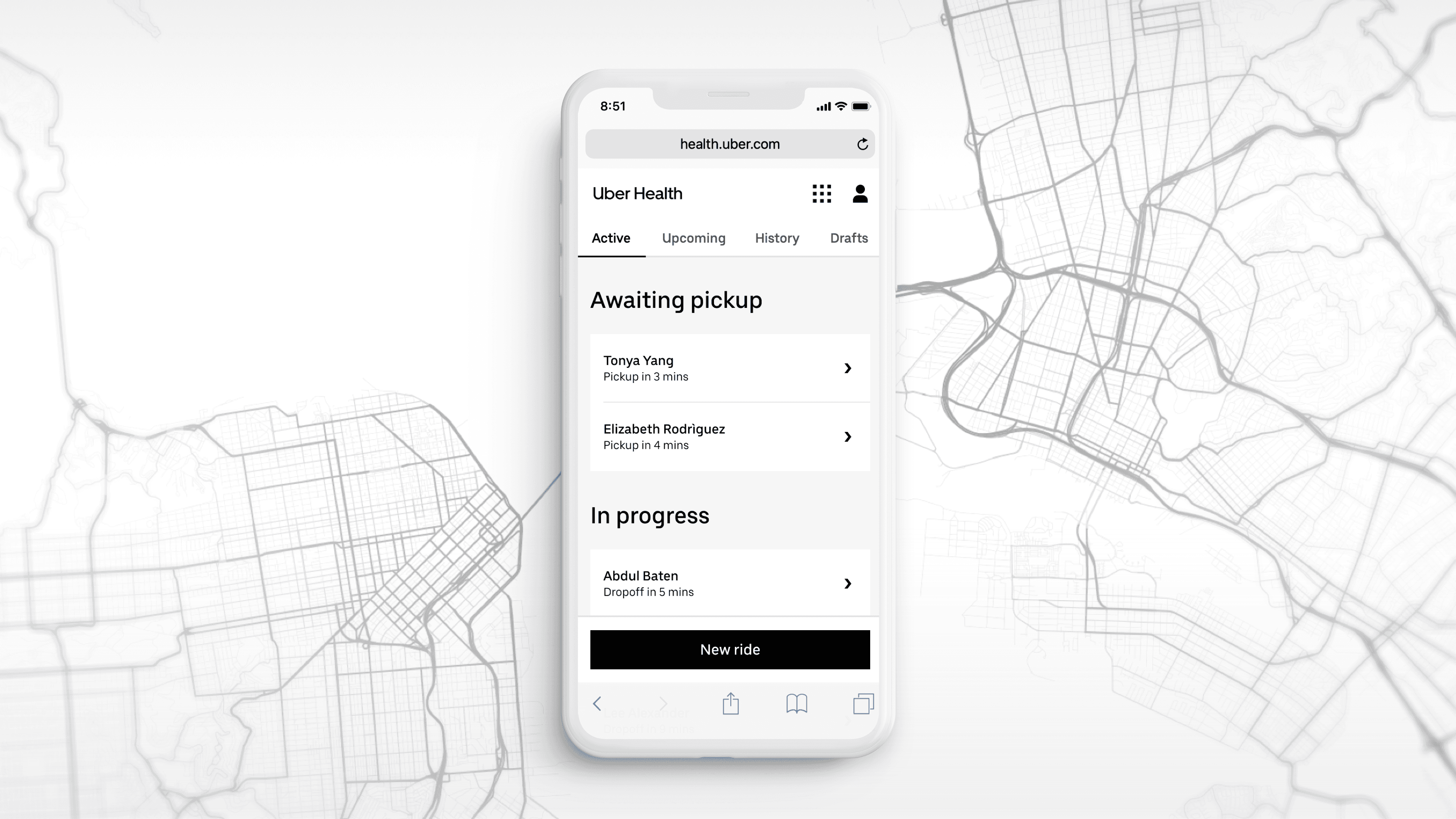
34% of all sessions over a 6 week period were on mobile devices… even though a mobile view wasn't supported and there dashboard wasn't designed to be responsive.
The design challenge
How might we take a non-responsive, desktop-first dashboard with a complex navigation structure and condense it down into a mobile friendly design?
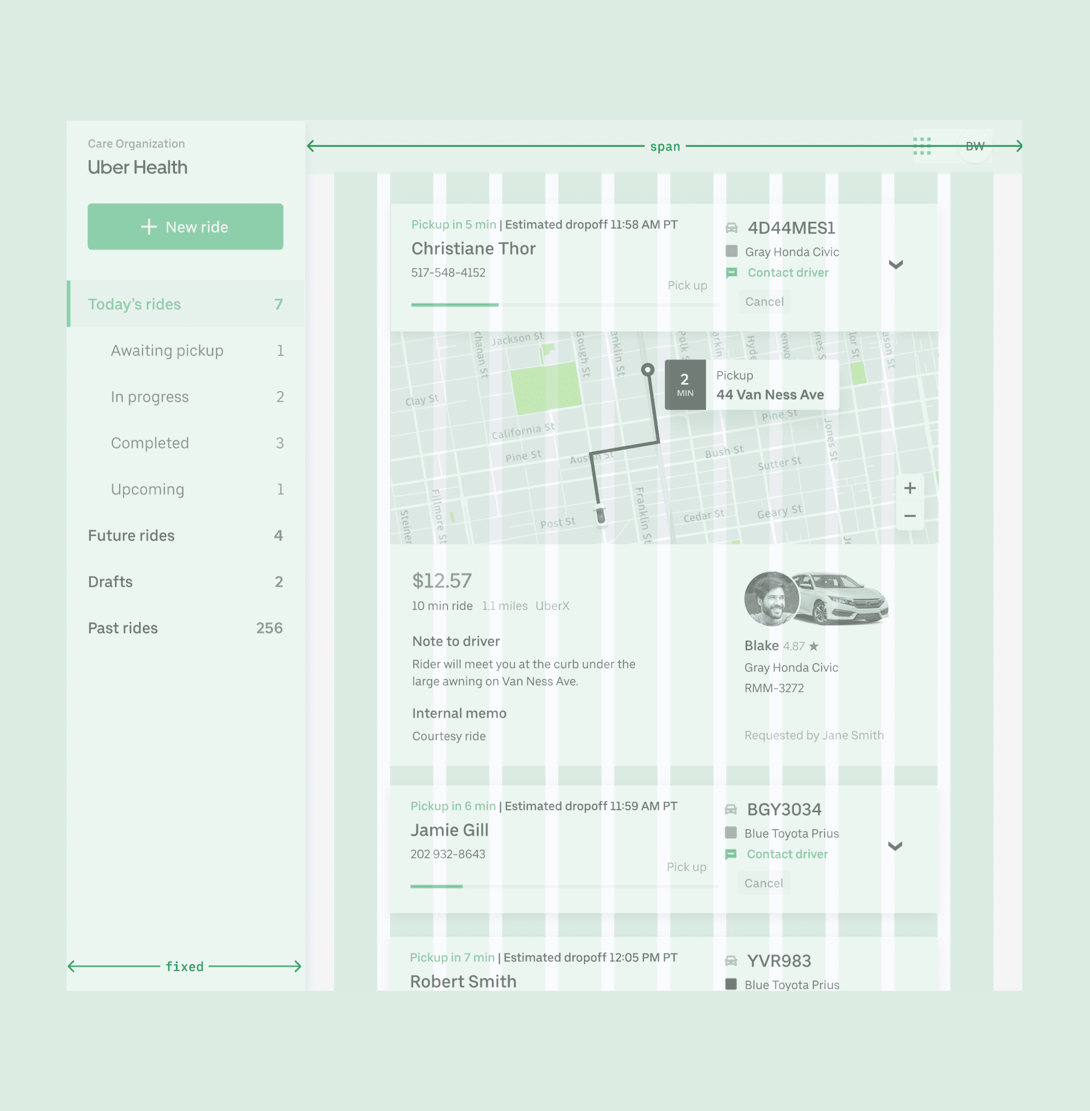
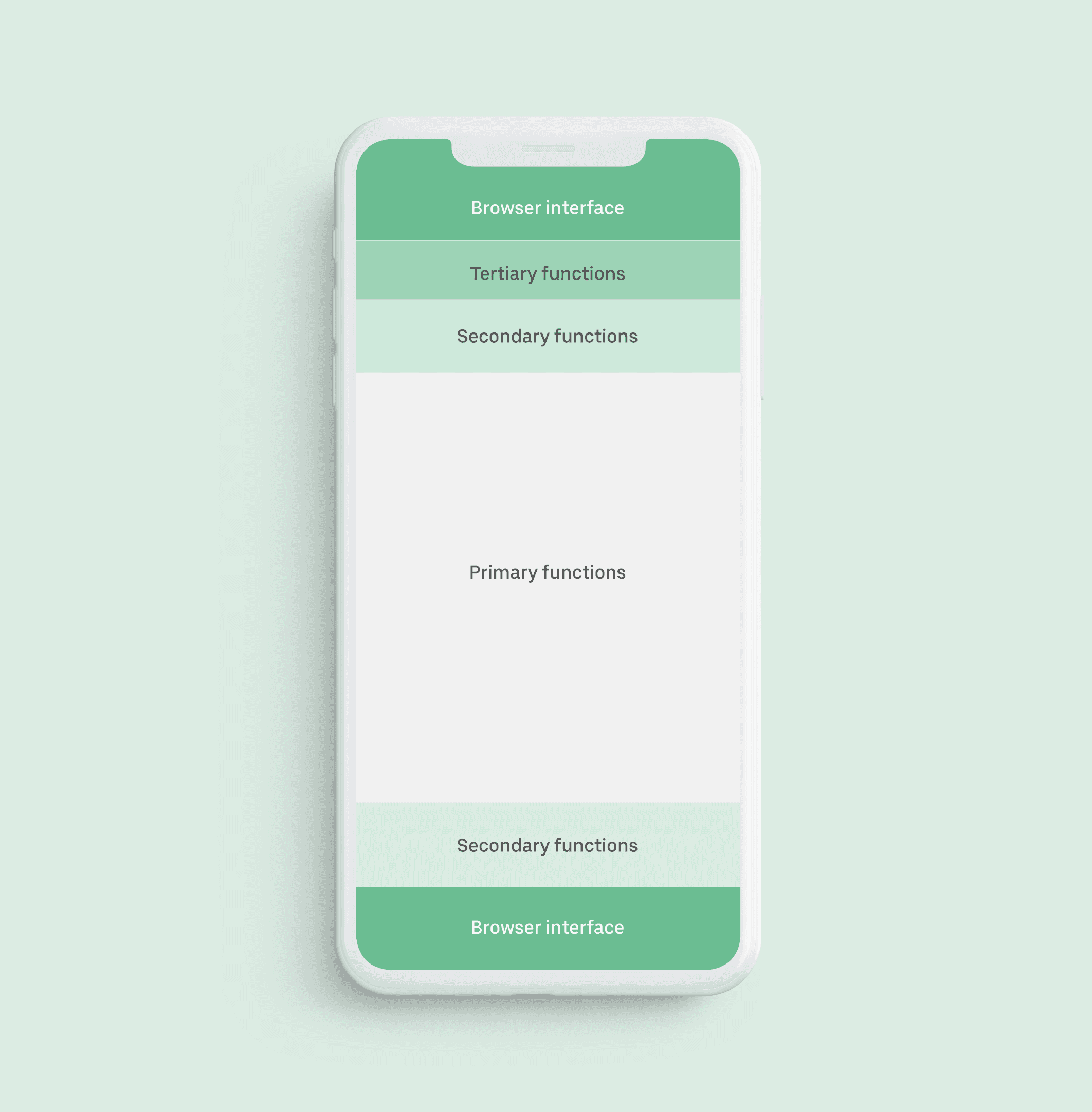
Design within reach
In rethinking the dashboard hierarchy, the core strategy was to surface the pertinent actions to ensure discoverability and to keep all key interactions no more than a single tap away.
Streamlined IA
Condensing the core navigation parent tabs helped to simplify the information architecture, while organizing content into four digestible categories.


Navigation considerations
Localization and overflow were key concerns for any navigation structure, as well as future growth and feature development (like prescription deliveries). An Intrinsic-width tab system was used to avoid avoid text wrapping or truncating. Horizontal scrolling allowed for overflow when tabs don't fit in viewport, accommodating expansion to new markets or additional products.
Ride cards: reloaded
The hierarchy of information was reorganized based on relevance to the coordinator. Extraneous details were removed or deprioritized in the ranking.
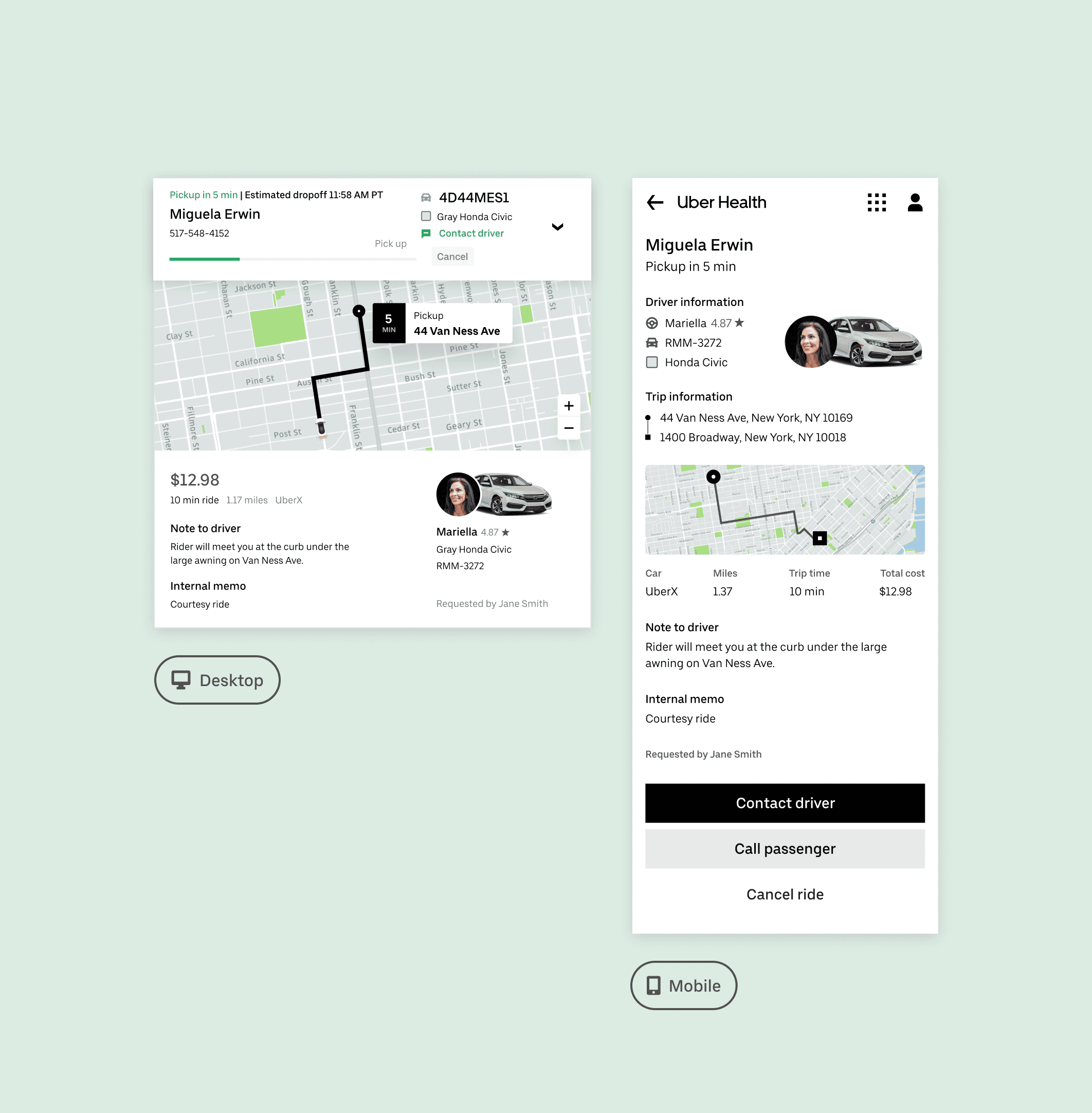
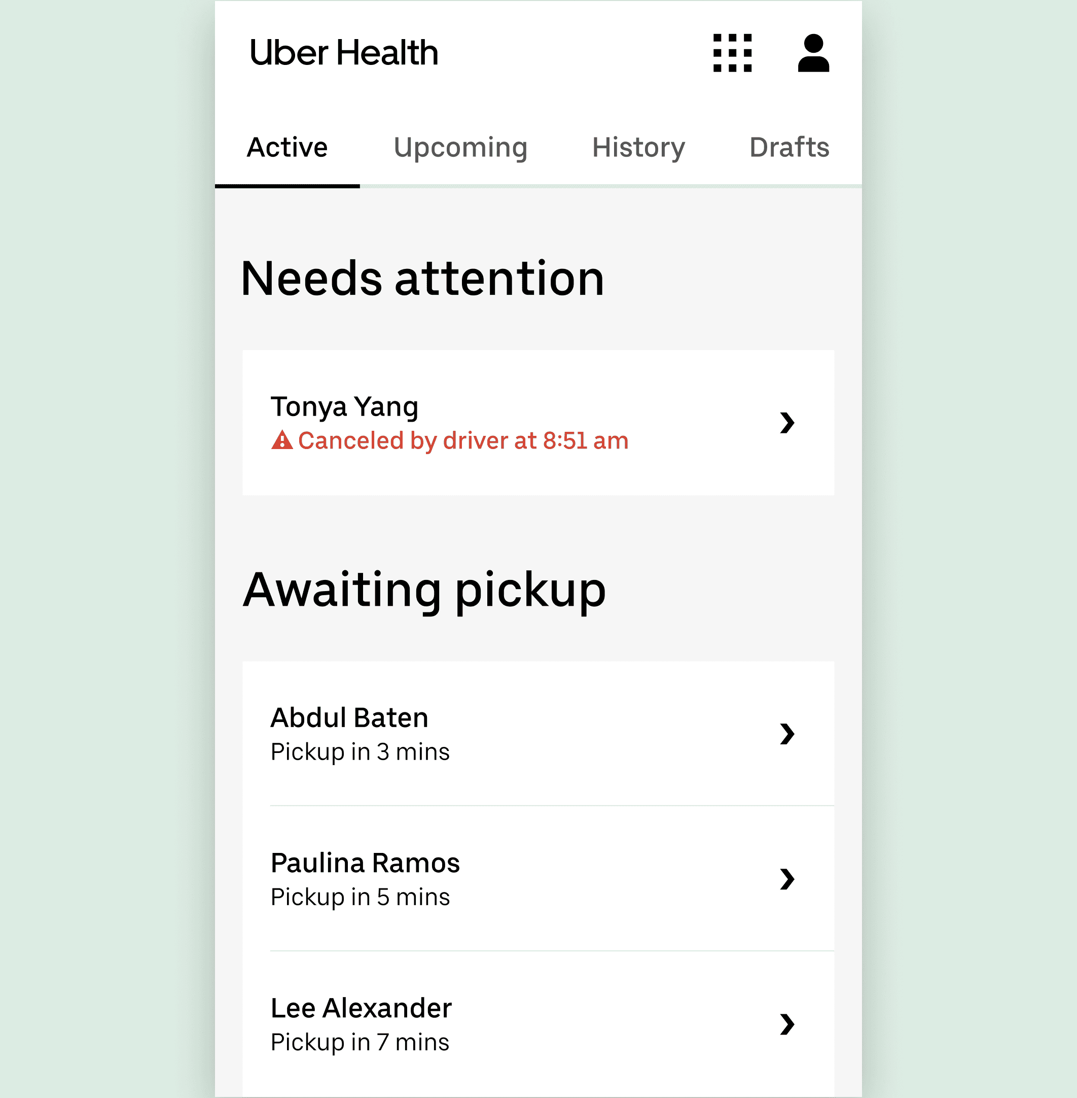
Actionable alerts
Rides that need attention are surfaced to the top of the active queue.
A brief description of the issue is accompanied by alert iconography and a pop of color to help to draw the user’s attention to the ride or rides in question.
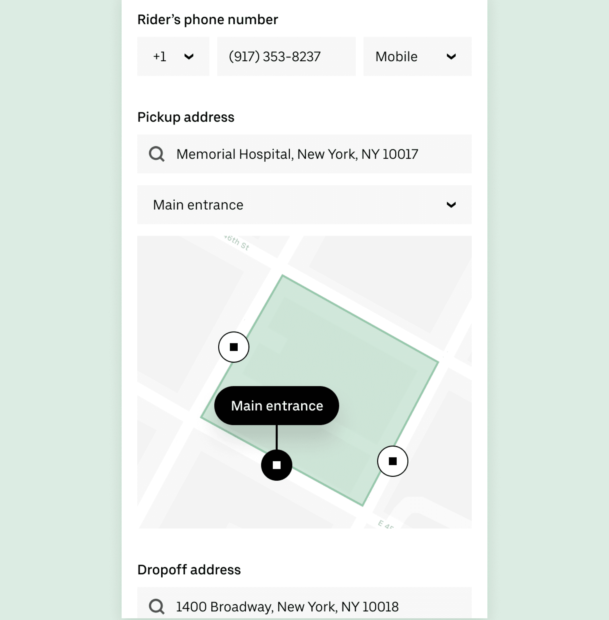
Designated pickup spots
The majority of cancellations were happening at large medical campuses with multiple pickup points, with 9/10 driver cancellations being listed as 'Rider no show.'
Designated pickup spots assisted in eliminating uncertainty about where a driver should wait for their passenger.

Results
4.8% increase in completion rates
Since the launch of mobile web and smart pickup spots, we have seen a dramatic 4.8% increase in completion rates for Uber Health and fewer cancellations.

Increased user satisfaction
NPS increased by double-digits after the mobile rollout and new feature integration. Mobile usage grew organically with no additional marketing or communication.

Competitive differentiator
The launch of this product was directly responsible for securing a multimillion dollar partnership that was contingent on having mobile support.
